
Sub Waypoints
a look at New York MTA subway data
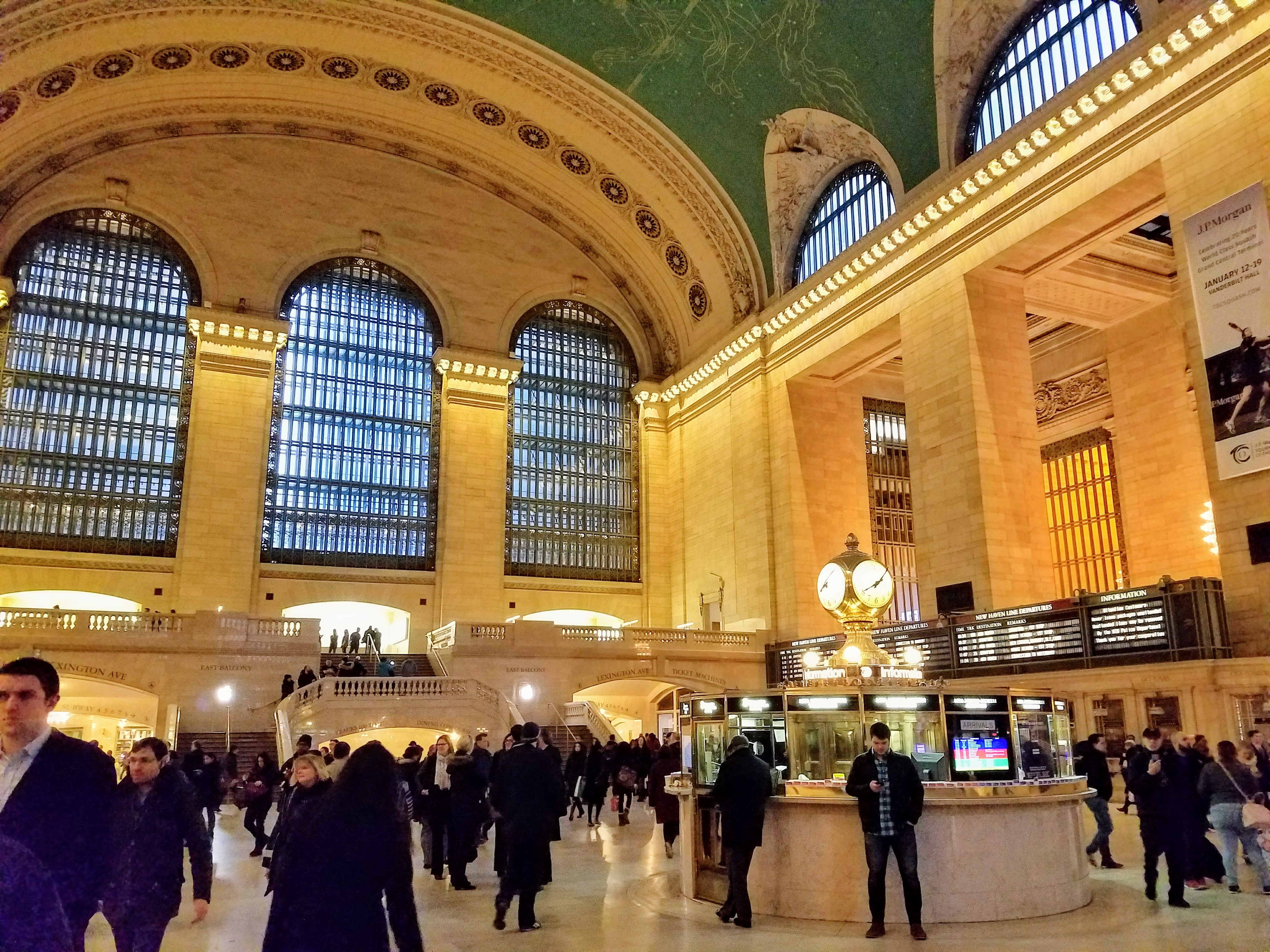
photo of Grand Central taken on my commute
Week one at Metis complete! Our first project was a group exploratory analysis project focused on exploring MTA turnstile data.
The Problem
For this first project we were tasked with helping a fictional non-profit WomenTechWomenYes(WTWY), optimize the effectiveness of their street teams. The street teams are placed at entrances to subway stations, and their job is to collect email addresses to sign people up to attend the yearly gala.
The Approach
My group identified three main goals of WTWY:
- Build awareness: Increase visibility and reach of the nonprofit
- Boost gala attendance: Engage individuals passionate about increasing the participation of women in technology
- Increase donations: Fund-raising is an integral part of the viability of any nonprofit organization
We decided to rank the subway stations by total foot traffic (entries and exits for all turnstiles at a station) to determine which stations were the most trafficked. We then wanted to filter this list to select high traffic stations, but not the most popular stations which tend to be commuter hubs and tourist areas. One member of our group had previously worked as a canvasser and reasoned that canvassers would be able to engage individuals better at less dense stations compared to somewhere like Grand Central which could be overwhelming. Lastly, we wanted to rank our list of selected stations by income to give priority to stations located in higher income areas.
The Data
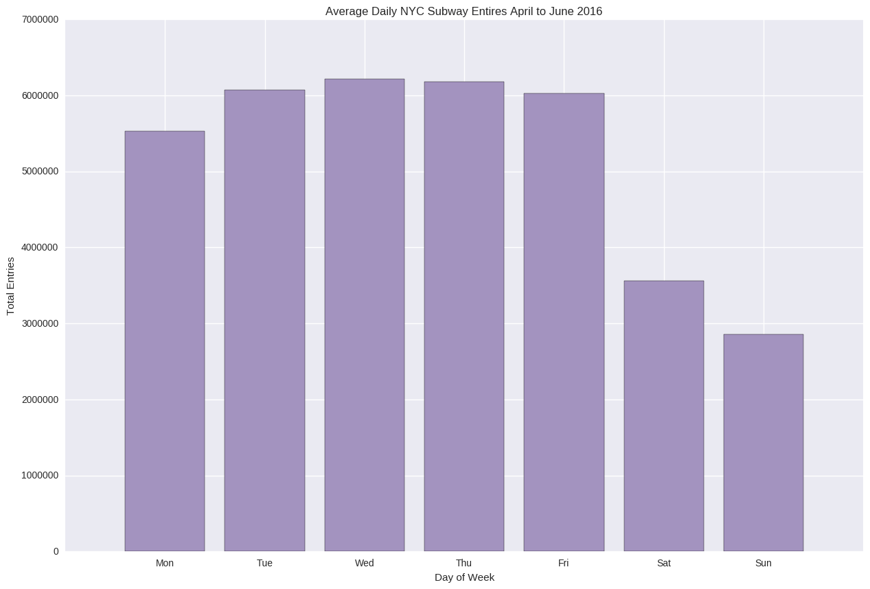
Since the gala will take place in early summer, we decided to look at the MTA turnstile data from April to June 2016 as this is the time frame that we assumed most of the canvassing would take place. We also used income data from The New Yorker’s “Inequality and New York’s Subway” project.
The Results
The MTA turnstile data was pretty messy, and cleaning was a long process. You can see the steps our group took here.
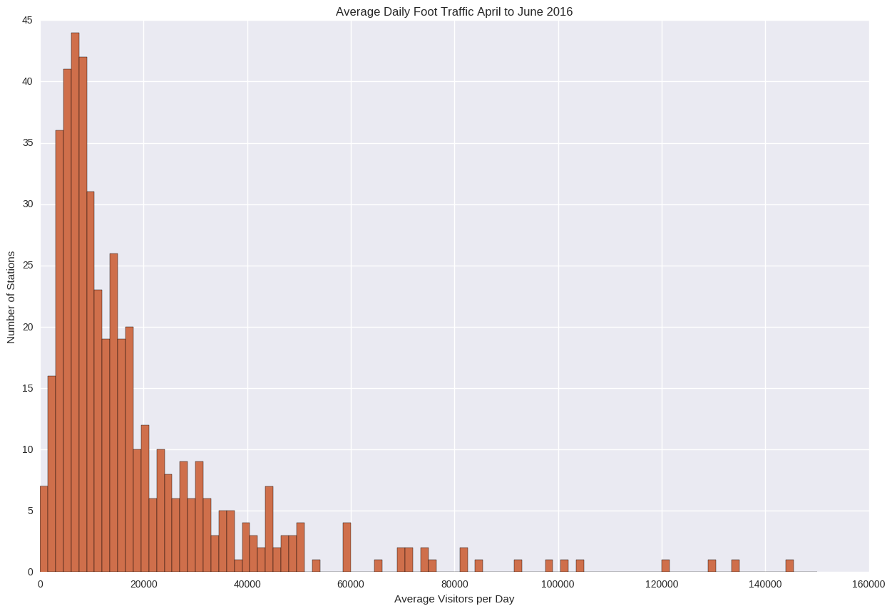
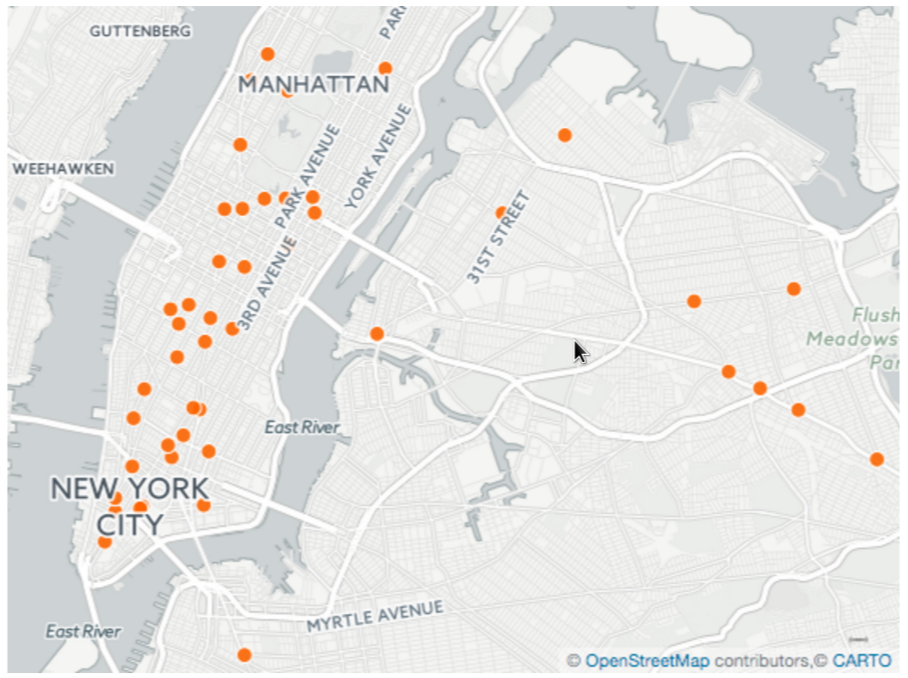
The above histogram shows the distributions of daily foot traffic for all stations. Our group decided to concentrate on the stations which fell in the 70th to 90th percentiles. This left us with about 100 stations which were still high traffic (Approx 20,000 to 40,000 visitors daily) without being overcrowded. Adding in the income data we sorted this list to give priority to stations in higher income areas.
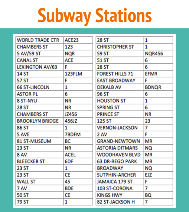
We assumed that WTWY, as a new organization, would have limited resources. Our final recommendation consisted of a list of 50 stations, and we suggested that WTWY engage 20 canvassers making up 10 teams of two. Each team would be assigned to a station for one week for continuity, and allow people who frequent the station to see the canvassers multiple times. After one week, the teams would rotate to a new station on the list. This would put a team at 40 stations, allowing room to move teams to other stations in case of any issues at a particular station. Below is the list of the 50 recommended stations in order:
To learn more about our project, check out our Github and presentation slides.